Jeff Rojas is a portrait and fashion photographer located in NYC. Jeff is a frequent instructor and mentor at Creative Live, WPPI, Fstoppers and more.
As a fashion and portrait photographer, I’ve had the pleasure of seeing my work featured in a variety of publications and prints. The downside of my fashion photography business is that I’m not directly in control of the printing process. My work is at mercy to the publisher’s budget constraints or simply the format the publisher chooses to print in.
Needless to say, this has led to some very “interesting” prints. Creating images for print requires a bit more consideration than when you’re simply uploading images digitally. Not only must you be aware of exposure, contrast and sharpness, but now the audience has the opportunity to physically hold your images and scrutinize them. You can’t cut corners retouching when you’re printing. That also means that you can’t blame it on low resolution.
Now don’t fear! That doesn’t mean you need to spend another hour retouching. In fact, I found that there’s three small, but life changing secrets to print perfect retouched images.
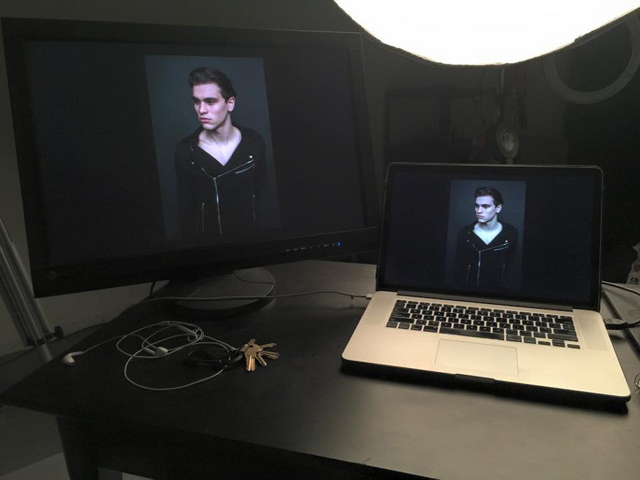
USE A COLOR CALIBRATED MONITOR
I’m going to assume that many of you reading this understand what a color correct image is, but in the event that you don’t, it’s simply making sure that your image displays the proper White Balance. This ensures that your subjects have a natural skin tone that isn’t too warm or too cool. A color calibrated monitor works in the same manner.
Now, I’ve had the unfortunate experience of retouching and color-grading a fashion editorial that printed too warm and saturated for my liking. Although I had originally corrected my White Balance, the image on my screen looked flat… so I inevitably oversaturated my image.
The truth is that you cannot depend on your eyes to be sure that things are color correct. Our eyes see colors differently depending on stress, fatigue and other factors. Proper monitor calibration makes sure that all of your colors and black levels are true and what you see is what you get. Your print will match exactly with what you’re editing.
Let me be clear, a dedicated color calibrated monitor can cost hundreds or thousands of dollars, (although if your budget allows it, I’d recommend investing in the EIZO CG247) but you don’t have to spend that much money to make sure that your monitor is color calibrated. The Datacolor Spyder4PRO is a great budget alternative to dedicated color calibrated monitors. The Spyder4Pro mounts to your screen and creates a color profile for your monitor to match your prints. Because your monitors colors will shift over time, you should be recalibrating your monitor regularly. The great thing about the Spyder4Pro is that it will remind you when it’s time to recalibrate your screen.
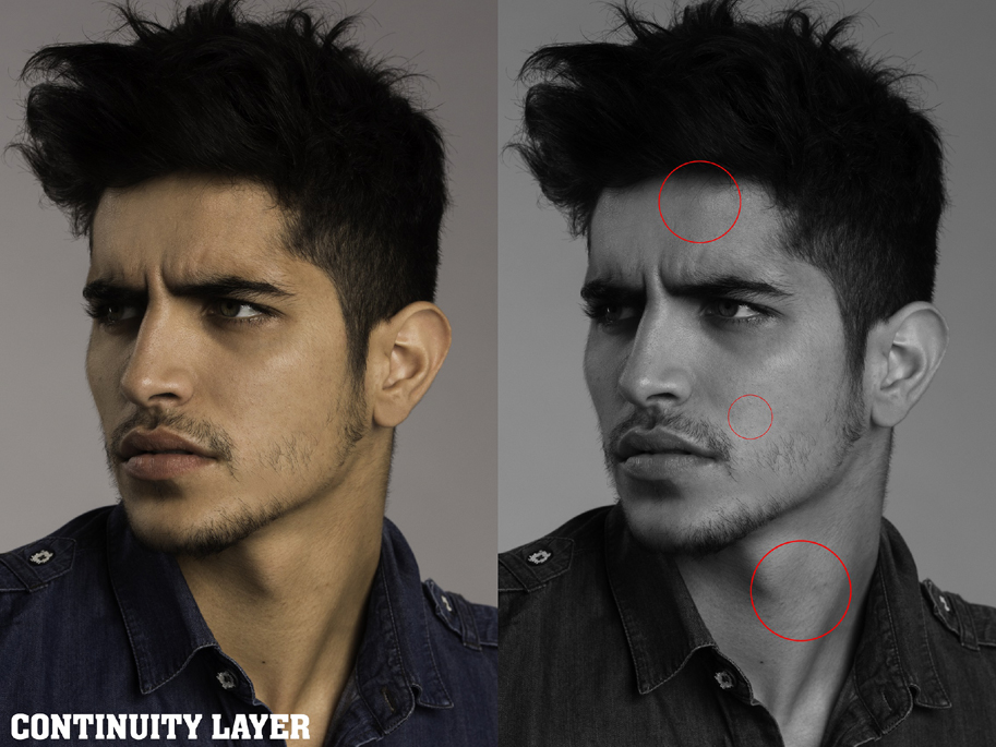
USE A CONTINUITY LAYER
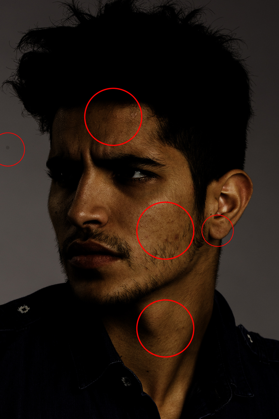
When you’re spending hours retouching images, your eyes start getting fatigued. At that point, color becomes overwhelming. The reds, oranges and yellows of skin color start merging together. If you’re on a time crunch or deadline and don’t have time to rest, use a continuity layer. A continuity layer is simply a “Black & White” layer over your image. This gives us the opportunity to focus on shifts in contrast and exposure when retouching and not just the colors themselves. When you’re retouching, I found this to be the easiest way to isolate blemishes from the rest of the skin. Wether you’re using the healing brush tool or advanced retouching techniques, like “frequency separation,” this will save your sanity.
Go to Create New Adjustment Layer / Black & White
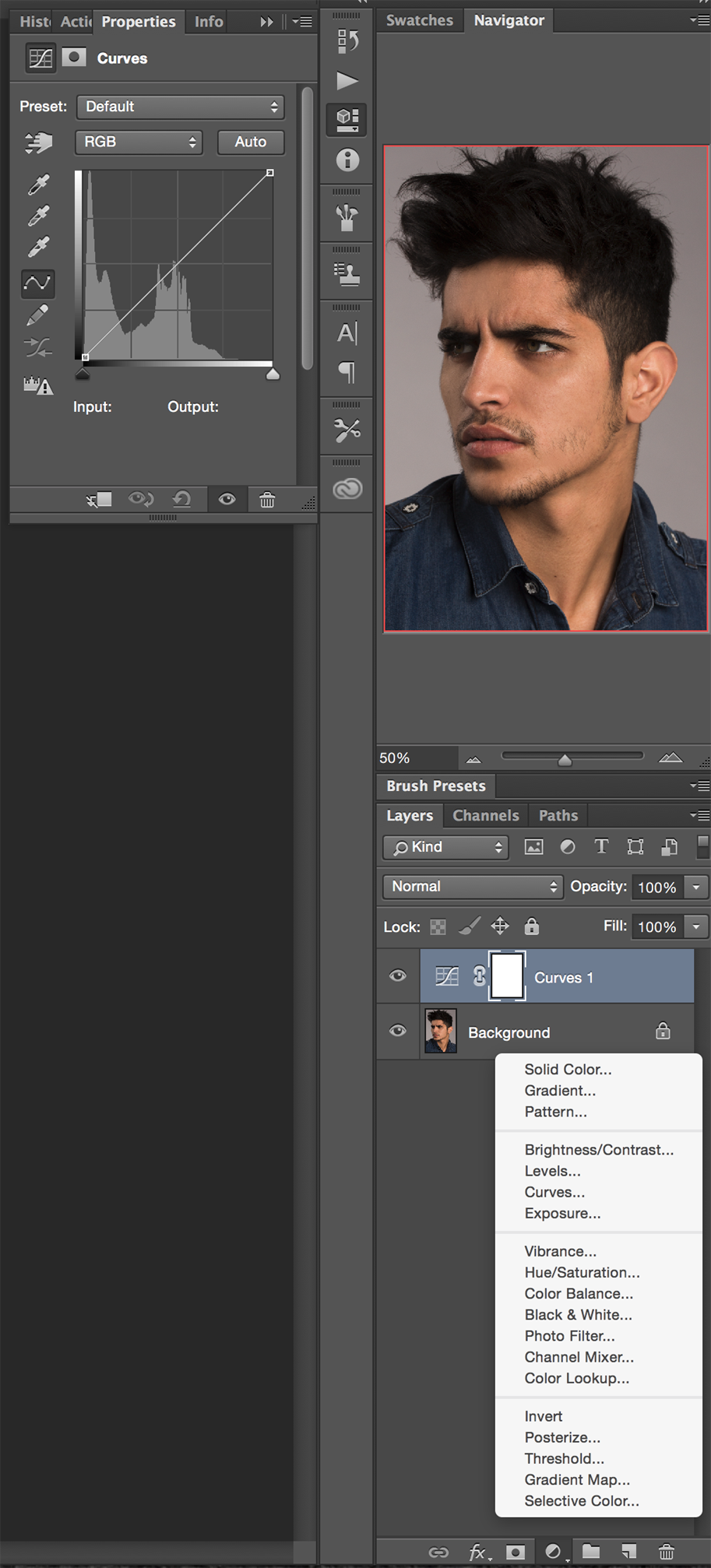
USE CURVE ADJUSTMENT LAYERS
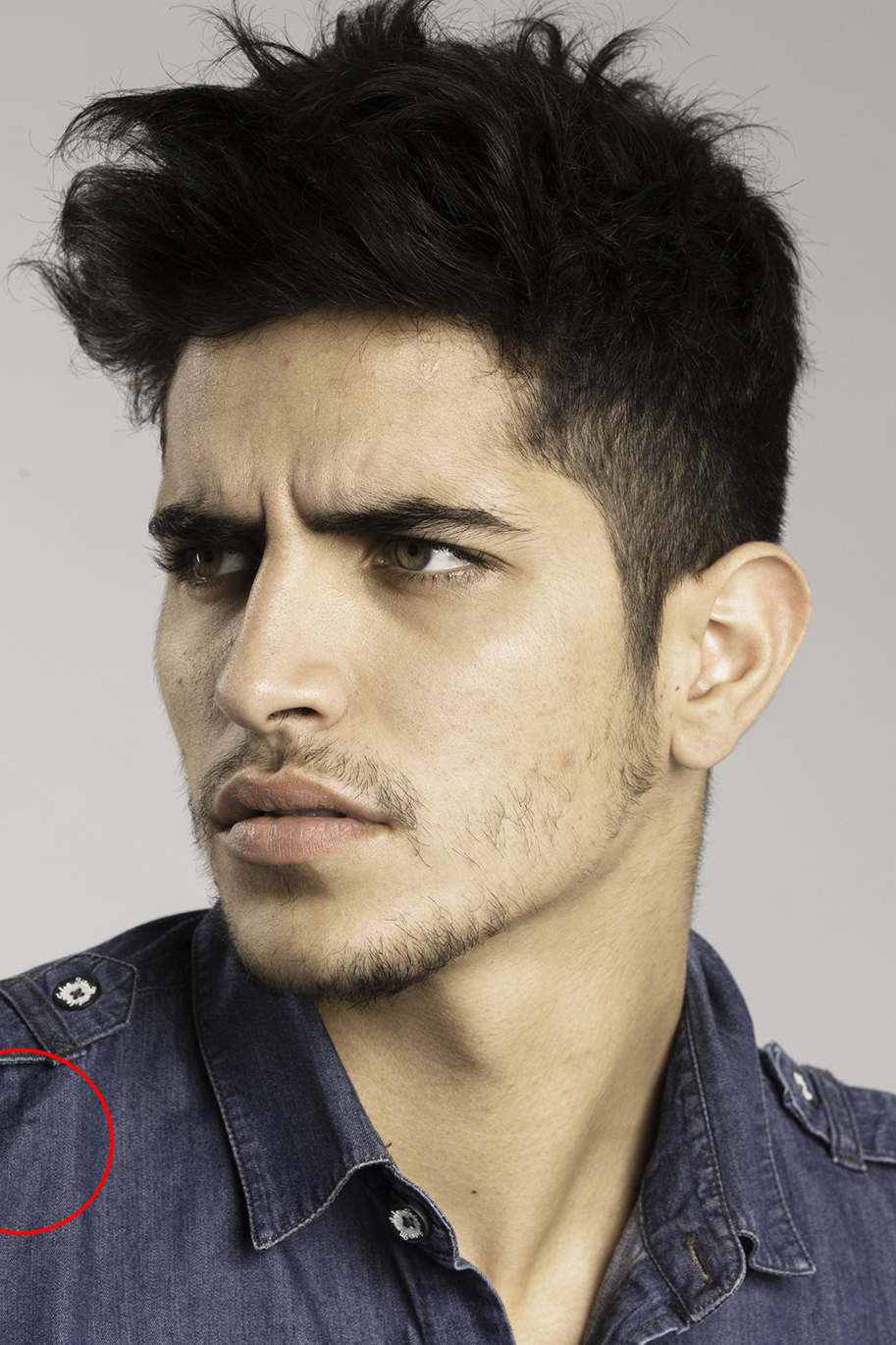
In addition to using a continuity layer, I use “Curve Adjustment” layers to validate my retouching. By over and underexposing my image, I’m able to see any errors in my retouching. This allows me to see any blemishes that I may have made retouching skin or elements that I may not have seen in the background that I need to remove. If retouching were accounting, this process would be your audit.
Go to Create New Adjustment Layer / Curves
To see more of Jeff’s work, follow him on Facebook, Instagram and Creative Live.


Awesome information
Great tips
Great tips, ones I have not heard before. I agree that the monitor is the most important feature, and some lower end consumer versions do not have the ability to show the full range of values and colors that are reproduce in printing. My studio has always made high quality prints for clients, and so managing color correction through the various changes in technology over the years brought a big learning curve. I am still using an older Eizo CG222W that has held up beautifully, and I consider it to be the most important piece of equipment in my business. More so than even my cameras or lenses, because without it, I would not be able to even asses if my capture is accurate. I wish I had not wasted 5 years struggling with other kinds of low-end monitors. I got smart and shopped for this one on Ebay, taking a good 6 weeks to wait for one to come available, but I got it for $600 and it is my prized possession. Saved me so much time and money in the long run!
This is a great help, thanks!
I loved this article. The way you showed the step-by-step process of retouching is awesome. I’m definitely going to try this my home.