Makayla Jade of The Harris Company
What I love about Miller’s Signature Albums most is how easy it is to sell multiple albums per client. We start our experience with our couples by helping them design the perfect show-off album or sign-in book using their engagement photos. I love watching the clients sort through the cover swatches and customize their cover to make it truly personal. When it comes time for the wedding album, they’re already familiar with the process and excited to craft the album of their dreams. Using the same design or sometimes a totally custom one, our couples can purchase smaller albums for their parents and/ or grandparents. Selling 2-5 albums per client has multiplied our revenue (without having to sacrifice more Saturday away from our family!).
Jenn Lewis Photography
I love a clean simple album design to keep the focus on the images. When designing the album, I make sure the images that I know my client loves are featured for the most attention, sometimes with an entire 2 page spread. I always show quite a few more images than my largest album holds. Where many photographers feel like too many images make it difficult for the client to choose, I believe that expertly guiding my client through the process of choosing final images helps them make those decisions, and I still have the opportunity to upsell to a larger album or additional spreads.
Albums By Elizabeth
Process:
I always prefer clients to choose their own photos – unless they really want me to and promise they aren’t picky! This is more work on their end but they are always happier with the final results and it makes revisions way easier. I am very firm with deadlines for clients. They have 1 week per revision and get a total of 3 revisions.
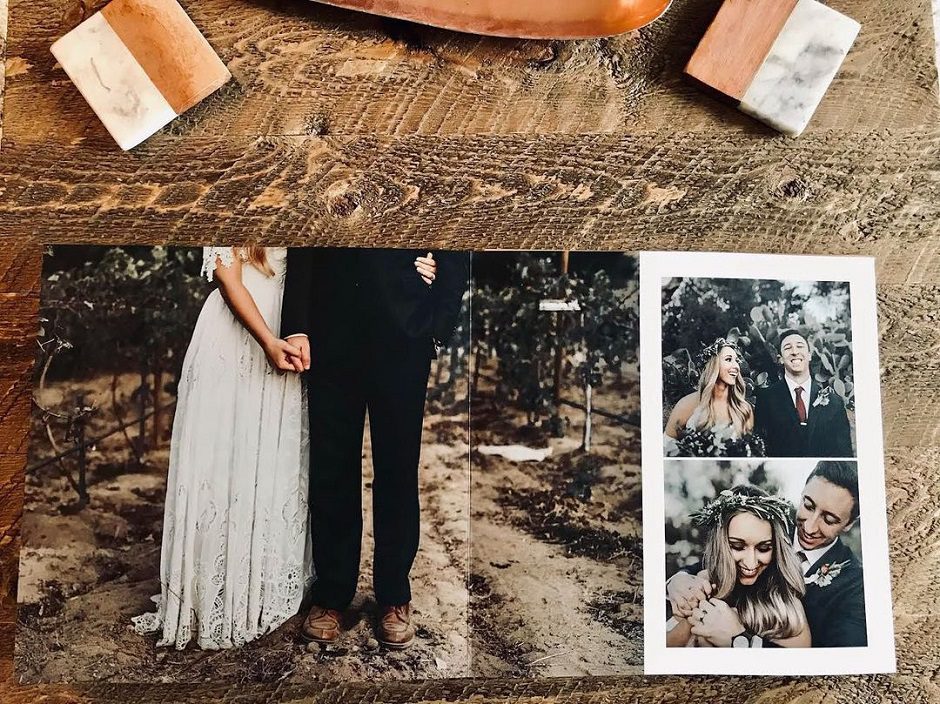
When printing with Miller’s, I generally print lots of pictures over the seam and it’s not an issue. However, I do try to keep faces off the seam. Through experience, I’ve learned that 99% of my clients want as little white space as possible. Once in a blue moon a client will ask for more white but it’s usually me figuring out how to crop so no white space is showing.
Choosing album details:
If a client asks, I love giving cover suggestions! It’s fun matching wedding colors to cover options because Miller’s has so many that something is going to match well. My personal favorites are the suedes and velvets.
One tip: I try to stay away from blind debossing on linens. I always recommend adding a color to the debossing on linen so it really stands out.
Silk is my go-to paper. I love that it feels super high-end and has just the right amount of shine. You can do gilding on the silk which I really like. My clients always remark how high quality the albums feel.
Carla Lynn Photography
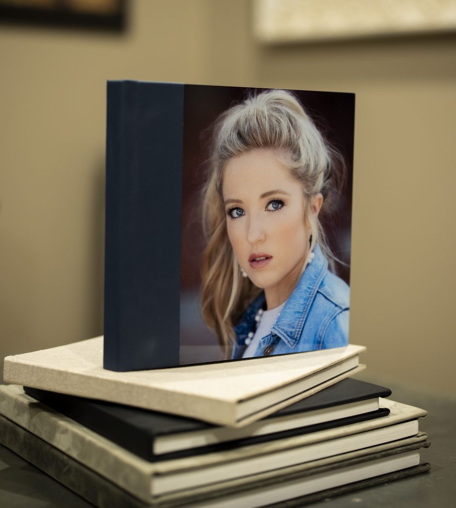
I am believer that you will sell what you show. So when our clients come into our studio and sit at our consultation area, the table in front of them has 5 albums, chocolate kisses, and our senior magazine. Ahead of them they will see a console with 6 more albums. Each area in our studio has albums laying around. We always find our clients looking through them and talking about them.
It is important to us to have current senior albums displayed. We often hear them talking about their “friends’” albums and showing current work means you are not outdated.
We keep the process as simple as possible for our clients. Depending on which session our clients choose, typically they see about 50 images and we will help them narrow down. They do not have to get it to a certain number as we tell them that we will prorate the spreads with the number of images chosen. Most clients will be between 30-45 images. Our clients get to choose the size, cover type and paper for the spreads. Showing them different samples helps the process go quicker and smoother. As for the layout and design, they understand and know that I, myself, will design the album and they trust me. Remember they hired you for your artistry and expertise.
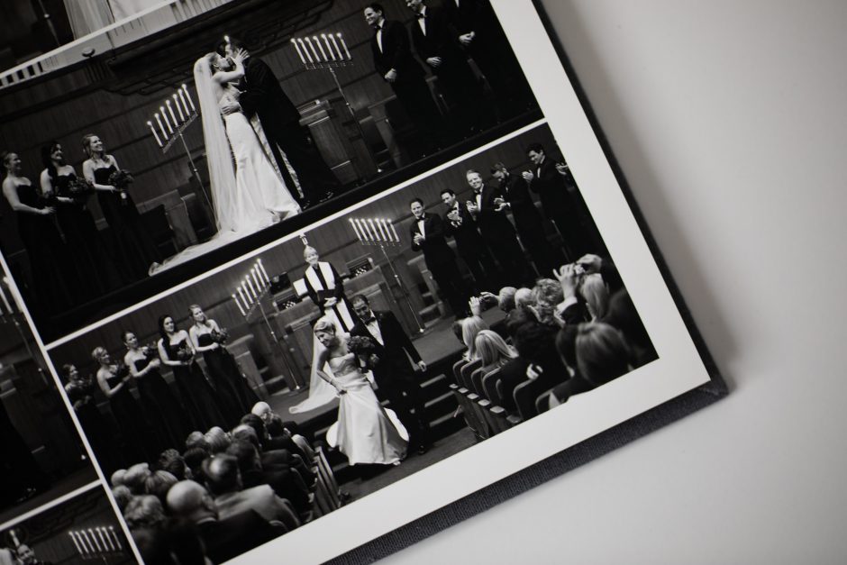
Each image in our album is artistically edited by our team and then I will design the album. I use a blank psd file that Miller’s provides as my template and have added a soft white-gray texture for the background. Yep, I design my albums from a blank slate and no two albums look the same. We do not add more than 2 images on a spread, keeping the images as a focal point and clean.
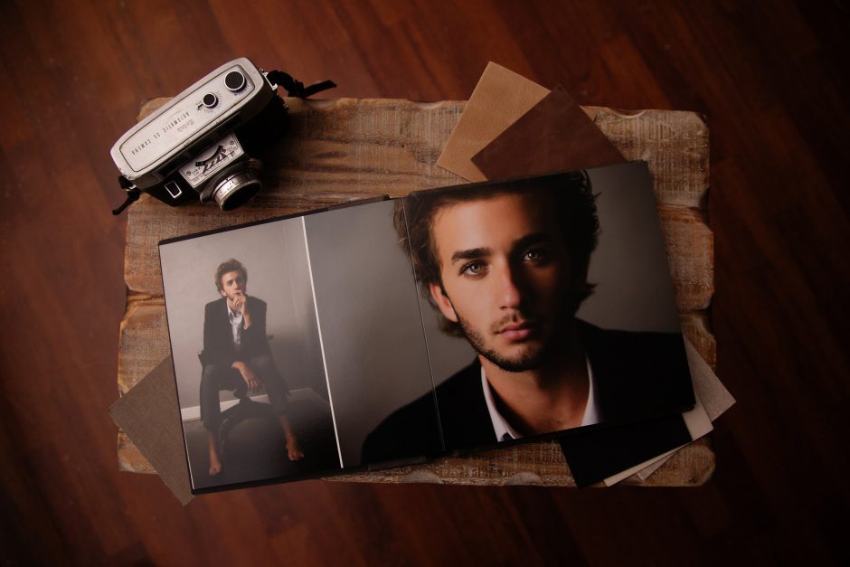
Our clients love the distressed leathers with the blind debossing. Photographic paper and Silk paper with rounded corners are another favorite.
Vanessa Joy Photography
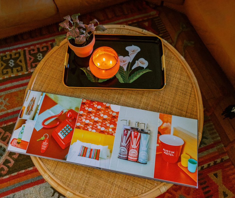
I believe all photographers should offer albums. It’s our job to both capture the story, and visually tell it. When I’m choosing pictures for my album I make sure to include each part of the day in the pre-design, and then let my clients decide what is most important to them, and what can be deleted. Secondly, I make sure to vary album spread designs so that the album doesn’t seem visually repetitive. I like breaking up the story with 3 or 4 full image spreads as well. Finally, while I love selling more album pages, it’s most important to me that my clients view me as a guide, and not a salesperson. If they want to add pages, great. If they want to stick to a budget and cut out pages, I’ll help them get there artistically and efficiently.
You can check out this video to watch me design a Miller’s Signature Album from start to finish.
Lauren Rosenau Photography
UNCOMPLICATED APPROACH:
A main goal I have in my business is to keep things as simple and uncomplicated as possible. Our uncomplicated approach begins with our A La Carte pricing structure, where we’re able to customize our client experience based solely on what our clients need and want from us on their wedding day. We always save the album conversation until *after* the full galleries have been delivered. To keep in line with our uncomplicated, unfussy approach to wedding photography, I’ve found that discussing album options before a client books just complicates everything. About a week after we deliver full galleries, we’ll send a follow email asking “Wondering what to do with all those images now?” (Because, guess what- people usually are). From there we’ll walk them through this design process:
BALANCE OF IMAGERY:
I encourage each client to make a folder on their gallery of favorite images (around 75 for a clean, sleek design) and I design the album around their favorites. The majority of the images selected by our clients tend to be from the family group and portrait variety, so I’ll go back through some of my personal favorites (mainly candids and some punchy details) to help even out the overall flow of the album. We’re always looking for balance in our imagery as well as album design. A whole album of group family formals falls a little flat, so taking the time to add in some flavor alongside the client picks is crucial.
COVER OPTIONS:
KEEP. IT. SIMPLE. Miller’s offers a wide variety of cover options, but to keep it simple for my clients, I’ve chosen my favorite 10 cover options and from those 10, will suggest 2 cover options per client that I believe fit each album best. The cover options I send our clients are inspired by the color palette or overall aesthetic of the wedding (cheat code: palette worn by the bridesmaids/groomsmen or the leather finish of a bride/groom’s shoes seems to always win). Again, we’re looking for cohesion, keeping things simple and for things that just make sense.
ARTISTIC FREEDOM OF LAYOUT DESIGN:
Wanna know a secret? I don’t ask for client approval on album design. Wanna know why? Well, because it’s a waste of time and because I’m the professional. My clients have invested in my expertise, they trust my judgment and complicating this process even more is a waste of time. We use Fundy to design all of our spreads and then send off to the magic-makers at Miller’s.
PRICING:
These albums sell themselves. Easy as pie: 3x’s what the album costs to make. Our process is so streamlined that it takes about an hour from start to finish to get the images, mess around with layout, design the cover and order. We want our albums priced so that our clients actually buy them. We believe imagery should exist outside of Facebook Profile photos and the occasional, usually untagged/credit-less (womp) Instagram posts. Providing our clients with an easy way to get an album on their coffee tables is the name of the game here. Keep it easy. Keep it affordable. Get it done. Repeat.
J&R Photography
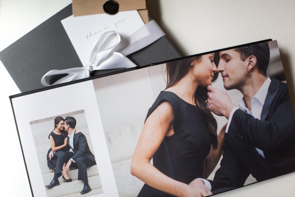
When designing an album, the most important thing for us is to tell a cohesive story with our imagery. The focus is on the moments themselves so we like to keep our spreads clean with no additional design elements and minimal images. We follow the flow of the wedding day from getting ready, to first look, to ceremony, portraits and finally reception. Our goal is to take our clients through a journey of their wedding day and relive each moment in the order it happened.
Allison from Jason Domingues Photography
We are huge proponents of wedding albums. People don’t print as many photos these days, so having an album that will still be around to tell our clients’ love stories generations from now is such a wise investment. We firmly believe the selling and designing of albums should be easy and stress free, not only for the client, but for us as well.
First off, we (as photographers) are the only vendor the client is still working with after the wedding (that’s when the bulk of our work takes place!). So, we want to do whatever we can to make it as easy as possible for as many people as possible to be able to afford an album. Clients always end up having to pay a ton of money for all of their wedding costs at the same time, right before the wedding. So we figured that since we are still working with them after the event, why not split up the cost and let them pay for part of the album afterwards too? We only require a small portion of the album cost before the wedding, and the remainder is split up into 1-3 payments that are deferred until after the wedding. However, the album itself is not ordered by us until the final payment is made. Our album sales went up exponentially once we started offering the payment plan.
When it comes to design, one thing we have learned over the years is that having the clients do the initial image selection is overwhelming for most people (we had clients who were putting it off for years when we had them select!). We design albums every day, and we don’t have an emotional connection to their images, so we always select the images and do the full initial design for our clients. When we send them their design to view online, they also receive instructions (via our proofing program) for how to request any changes they want to see (photo swaps, additions, deletions, etc). We always tell our clients that we do the hard work initially of giving them a full design as a starting point, but after that, it is a collaborative process. Albums never go to print until the client approves the design and selects the cover material and options. Our clients appreciate the collaborative process because obviously they want to have a say in what goes into their albums, but us giving them guidance and recommendations is part of what they are paying us to do! Clients are allowed unlimited change requests, but the design must be approved within 3 months of the initial design, or there is a fee. That gives them enough time to spend with the design to make sure it’s perfect for them, but it also keeps them moving along and ensures that the project doesn’t go on too long.
To keep things easy on our end, we don’t offer every single cover material and option that Miller’s has to our clients. We have one album size for our clients (10×10) and one size for parents books (8×8). We only offer leathers and linens, and only cameo and debossing options for the covers. Sometimes less is more, so we thought about what WE would want in an album if it was ours, and make sure to only offer materials and designs that are cohesive with our branding and style.



This is a fantastic read, thank you so much to everyone who contributed!! I love being inspired by other bright minds in our industry. 🙂